Mastering the Color Wheel: A Guide for Traditional Quilters and Fiber Artists
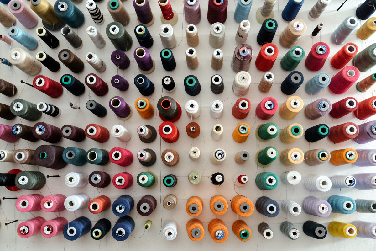
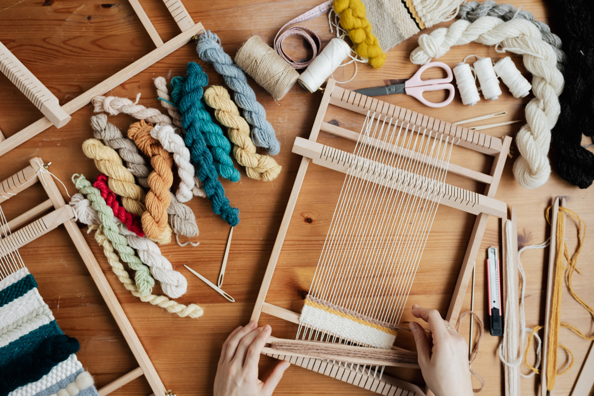
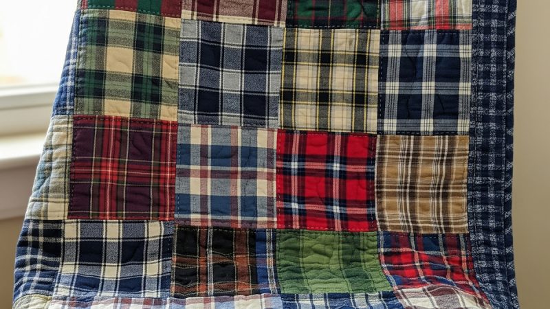
Color is the heart of any textile project. Whether you are piecing together a heritage quilt from flannel scraps or preparing a fresh batch of hand-dyed wool, understanding the relationship between colors is what transforms a simple project into a work of art.
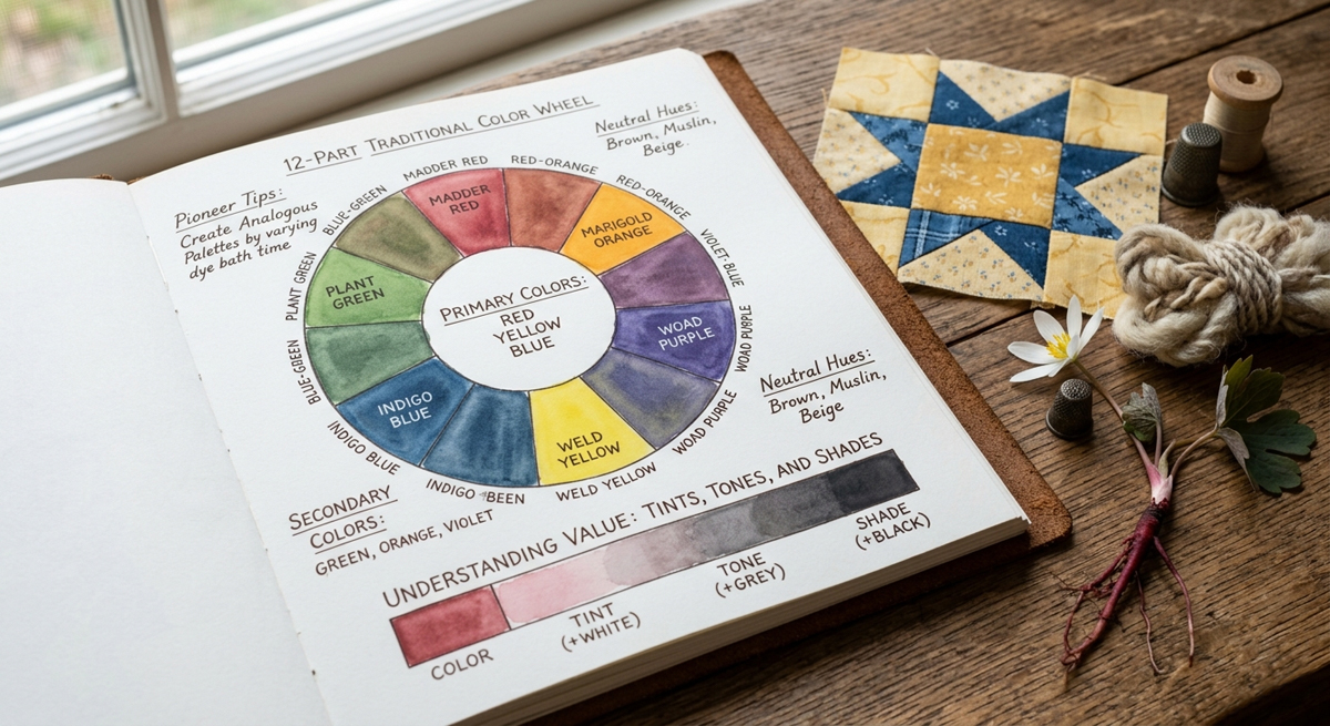
In the world of traditional crafts, we often look to the “Color Wheel” as our primary map. This twelve-part system helps us predict how colors will interact before we ever make the first cut or dip a single skein into the dye pot.
The Anatomy of the Color Wheel
The wheel is divided into three distinct categories. Understanding these is the first step in mastering “Self-Reliance” in your design work.
1. The Primary Colors: The Foundations
Red, Yellow, and Blue. These are the “root” colors. In traditional dyeing and painting, these cannot be created by mixing other colors together. They are the starting point for every other hue in existence.
2. The Secondary Colors: The First Mix
When you combine two primaries in equal measure, you create a secondary color:
-
Red + Yellow = Orange
-
Yellow + Blue = Green
-
Blue + Red = Violet (Purple)
3. The Tertiary (Intermediate) Colors: The Nuance
These are created by mixing a primary color with its neighboring secondary color. These are often the “earth tones” or “soft tones” we see in nature, such as Red-Orange, Yellow-Green, or Blue-Violet.
Defining Your Palette: 3 Classic Color Schemes
Once you understand the wheel, you can use these proven formulas to choose fabrics or dyes that are guaranteed to harmonize.
Analogous Colors (The “Good Neighbors”)
Analogous colors sit next to each other on the wheel (e.g., Yellow, Yellow-Green, and Green). These palettes are naturally restful to the eye because they share a common “under-color.”
-
Pioneer Tip: If you are working with a monochromatic natural dye—like the deep reds from Bloodroot—you can create an analogous look by varying the intensity of the dye baths to create a range from soft peach to deep rust.
Complementary Colors (The “Dynamic Duo”)
These are colors directly opposite each other on the wheel, such as Blue and Orange, or Red and Green. Because they are opposites, they make each other appear brighter and more “intense” when placed side by side. Use this scheme when you want a specific pattern or “star” block in your quilt to pop.
Monochromatic (The “Single Soul”)
A monochromatic scheme uses only one color but varies the Value (lightness or darkness).
Understanding Value: Tints, Shades, and Tones
In quilting, we often talk about “Light, Medium, and Dark.” In the professional arts, we use more specific terms to describe how we alter a color’s value:
-
Tint: A color plus White. These are your pastels and light-dusted fabrics.
-
Shade: A color plus Black. These are your deep navy blues, forest greens, and rich burgundies.
-
Tone: A color plus Grey. This “muddies” the color slightly, making it look more like a vintage or “heritage” fabric.
The Role of Neutrals: Finding Rest
Neutral pigments—Black, White, and Grey—are essential for giving the eye a place to rest. However, in traditional homesteading crafts, we also consider “Nature’s Neutrals”: Brown, Beige, and Muslin.
-
Beige and Muslin: These act as the perfect background, allowing your primary colors to shine without competition.
-
Dark Brown: Often more “organic” than a stark black, dark browns (traditionally achieved through walnut hull dyes) provide a dramatic, grounded feel to a traditional quilt.
Warm vs. Cool: Setting the Mood
Finally, consider the temperature of your project:
-
Warm Colors (Reds, Oranges, Yellows): These colors are stimulating and “forward.” They make a room feel cozy and the quilt feel “cuddly.”
-
Cool Colors (Greens, Blues, Violets): These are calming and “receding.” They are perfect for a peaceful bedroom environment.
By mastering these simple rules of color theory, you move beyond just following a pattern—you begin to design with the authority of a seasoned artisan.
The Author:
Pioneerthinking.com: Ingredients for a Simple Life. Insights from a seasoned professional rooted in country living, with 28 years of horticulture expertise and over two decades of practical experience in homesteading, natural beauty and cosmetic creations, natural health, cooking and creative living.
Photo. Gemini